The CRO-centered design attempts to convert visitors to your website by emphasizing the user experience, to make their visit so enjoyable that they are predisposed to take any desired action which you propose to them. When you’re talking about CRO UX design, there are some specific elements that you can include in your website design that will expedite conversion rates, and which will support all your efforts at acquiring new customers.
Your Website Menu
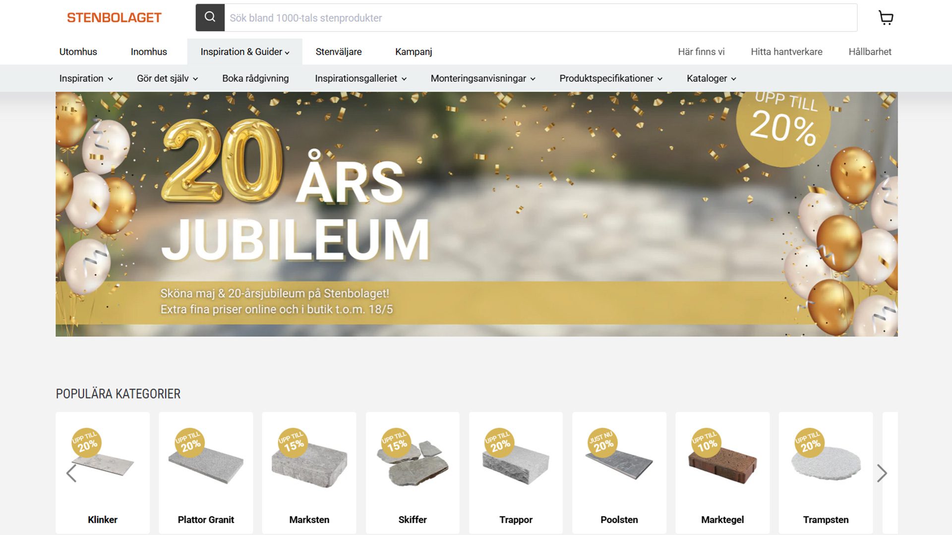
This is a very important element for any visitors to your website who are either new or who are frequent customers because a site menu that is very clear and has easy accessibility will contribute strongly toward better navigation. Your site menu should be a very useful feature for your website, including drop-downs and subcategories, so that desired information can be easily located by any visitor. You need to resist the temptation of cluttering up your site menu because if it isn’t clear and easy to use, most users won’t bother to take the time. Make sure content is loaded quickly, and don’t post too many details on your site menu – that information can be displayed elsewhere.
Call to Action Button
Driving conversions is usually your number one priority, so you must have a clearly visible call to action button. Make sure that it’s clear to the user what kind of action will be taken by clicking on the CTA button, and make sure all of the content on the page guides the user toward actually performing that click.
Navigation for Internal Anchor Text
If you’re not familiar with this component, it provides website visitors with the content and terminology which is situated on the site map. No matter what kind of subject matter you might be offering, you should attempt to provide answers to users’ most frequent questions, and if you can provide a predictive search bar, that will allow for quick retrieval of such information.
Pop-up Chat Boxes
This relatively new feature is one of the very best ways of engaging with website visitors right on the spot. A pop-up chat box is usually triggered by the behavior of a visitor to your website, specifically their intent to ask a question about a given service or product or to simply gather additional information. Pop-up chat boxes are generally appreciated by website visitors because they can be very helpful in answering questions, and they’re less likely to interrupt a visitor who has just arrived at your website.
‘Before You Leave’ Pop-up Text
This text is generally triggered when it becomes evident that a visitor is about to leave your website, and it gives you one last chance to appeal to them and try to pull off the conversion. Generally, the headline of your exit pop-up box should include some kind of very appealing offer that would motivate your user to linger and to possibly take a conversion action. This, in turn, would lead to a sign-up form that requests some kind of personal information like an email address or a name. Whatever text you use for your ‘before you leave’ dialog box, it should not detract from the call to action, but should instead serve to reinforce it, and should make one last attempt at converting the user.
