If you want to generate leads, drive sales, or achieve other marketing goals, you’ll need a high-converting landing page. Whether you’re launching a new product, promoting a service, or building your email list, a well-crafted landing page can make the difference between success and failure. In this article, we’ll break down the key elements and best practices for creating a landing page that not only attracts visitors but also converts them into customers.
1. Understand Your Audience
Before you start designing your landing page, it’s essential to have a deep understanding of your target audience. Consider:
- Demographics: Age, gender, location, income level, etc.
- Psychographics: Interests, values, pain points, and motivations.
- Behavioral data: Past interactions with your brand, purchase history, etc.
Understanding these factors will help you tailor your messaging and design to resonate with your audience, increasing the likelihood of conversion.
2. Craft a Compelling Value Proposition
Your value proposition is the core of your landing page. It’s a clear statement that explains why your product or service is valuable, how it solves your audience’s problem, and what sets it apart from the competition. A strong value proposition should be clear, concise, benefit-focused, and unique.
Highlight what makes your offer different and better. Display this prominently on your landing page as part of the headline or subheadline.

3. Use a Clean and Focused Design
A high-converting landing page is often simple and focused. Here are some design principles to follow:
- Minimal distractions: Limit the number of links, buttons, and images that could divert attention from the main goal.
- White space: Use white space strategically to make your content easier to read and navigate.
- Consistent branding: Ensure your landing page aligns with your brand’s visual identity.
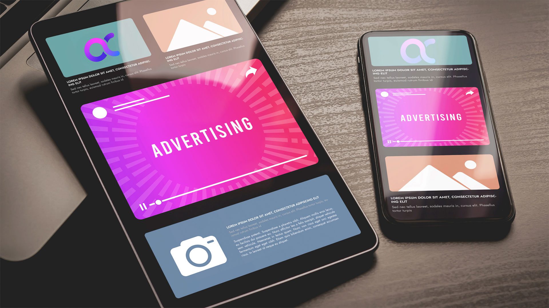
- Responsive design: Make sure your landing page is optimized for all devices, including mobile phones and tablets.
Remember, the goal is to guide the visitor’s attention to your call-to-action (CTA) without overwhelming them with too much information.
4. Write Persuasive Copy
Your landing page copy needs to be engaging and persuasive. Achieve that by:
- Addressing pain points: Speak directly to the problems or needs of your audience and explain how your offer solves them.
- Using social proof: Include testimonials, case studies, or trust badges to build credibility.
- Creating urgency: Encourage immediate action by incorporating time-sensitive offers, limited availability, or special discounts.
- Being conversational: Write in a friendly, approachable tone that makes the reader feel understood.

Every word on your landing page should serve a purpose—whether it’s educating the visitor, building trust, or encouraging them to take action.
5. Design an Effective Call-to-Action (CTA)
The CTA is arguably the most critical element of your landing page. It’s the action you want visitors to take, whether it’s signing up for a newsletter, downloading an eBook, or making a purchase. Here’s how to optimize your CTA:
- Use strong action verbs: Phrases like “Get Started,” “Download Now,” or “Claim Your Offer” are more compelling than generic options like “Submit.”
- Make it visible: Your CTA button should stand out from the rest of the page, using contrasting colors and bold text.
- Keep it simple: The fewer steps required to complete the action, the better. If possible, limit the number of form fields or clicks needed.
- Repeat the CTA: If your landing page is long, include the CTA at multiple points to capture visitors at different stages of their journey.
6. Implement A/B Testing
A/B testing, or split testing, involves creating two or more versions of your landing page to see which one performs better. Test different elements such as headlines, images, CTAs, and copy to identify what resonates most with your audience. A/B testing is an ongoing process—continuously refine and optimize your landing page based on data to improve conversion rates over time.
7. Leverage Visuals and Media
High-quality visuals can significantly enhance the effectiveness of your landing page. Consider incorporating:
- Images: Use images that are relevant to your offer and resonate with your audience. Avoid stock photos that feel generic or impersonal.
- Videos: A short, engaging video can help explain your product or service, showcase testimonials, or demonstrate features.
- Infographics: If your offer involves complex information, an infographic can make it easier to understand and more visually appealing.
Visuals should support your message rather than overshadow it. To avoid slowing down your page, make sure they’re optimized for fast loading.
8. Optimize for SEO
While your landing page’s primary goal is conversion, it’s also important to optimize it for search engines. Here are some basic SEO tips:
- Use relevant keywords: Incorporate keywords that your target audience is likely to search for.
- Meta descriptions: Write a compelling meta description that summarizes your offer and encourages clicks.
- Alt text for images: Use descriptive alt text for images to improve accessibility and SEO.
- Fast loading times: A slow loading page can hurt both your SEO and conversion rates.
- Balancing SEO with user experience is key—never sacrifice the quality of your content or design just to stuff in more keywords.
9. Analyze and Optimize
After launching your landing page, it’s crucial to track its performance using analytics tools like Google Analytics, Hotjar, or your preferred platform. Monitor metrics such as:
- Conversion rate: The percentage of visitors who complete your desired action.
- Bounce rate: The percentage of visitors who leave your page without taking any action.
- Average time on page: How long visitors stay on your landing page.
- Traffic sources: Where your visitors are coming from (e.g., search engines, social media, email campaigns).
- Use this data to identify areas for improvement and continue to optimize your landing page over time.
10. Follow Legal and Ethical Guidelines
Finally, ensure your landing page complies with relevant legal and ethical standards:
- Privacy policies: Clearly state how you’ll use visitors’ data and obtain their consent if necessary.
- Accessibility: Make sure your landing page is accessible to all users, including those with disabilities.
- Transparency: Be honest and clear about what visitors can expect when they take action. Avoid misleading claims or hidden fees.
A high-converting landing page is not just about getting clicks—it’s about building trust and delivering value to your audience.
Creating a high-converting landing page requires a blend of strategy, creativity, and ongoing optimization. By understanding your audience, crafting a compelling value proposition, designing with clarity, and testing relentlessly, you can build a landing page that not only attracts visitors but also turns them into loyal customers. Remember, the key to success lies in continuously analyzing performance and making data-driven decisions to refine your approach.


